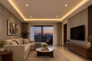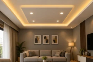
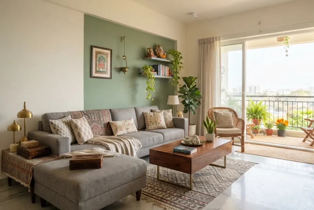
If you’ve typed “two colour combination for living room” into Google and closed twelve tabs without picking anything, that’s normal, honestly. Most guides show combinations shot in bright American living rooms with ten foot ceilings and skylights. That’s not what you’re working with. You’ve got a standard Bangalore 2BHK, builder white walls, one balcony window, and the same marble effect vitrified tile that seems to come standard in every new project in the city.
Short version, if you want it before reading further: white or warm grey as your dominant colour, a deeper accent, sage green, charcoal, or terracotta, on one wall, roughly a 70:30 split. It survives low light, it works with flooring you didn’t choose, and it doesn’t fight the furniture your family already owns.
The rest of this is the longer explanation, written the way we’d actually say it to someone sitting across the table at Blue Interiors, not the way a paint brand’s marketing team would write it.
Why Two Colours Beat One
Paint every wall in a small room the exact same colour and something odd happens. There’s nothing for your eye to land on, so the room reads flatter and smaller than it actually is, not calmer, just smaller. Two colours give the eye a stopping point. I’ve had clients resist this at first, worried a second colour will make the room busy, and then call back a week after the paint dries to say the room finally looks like someone designed it instead of just painted it.
There’s a local reason this matters too. Most Bangalore flats have one wall that’s a little awkward, a beam cutting across it, a shorter stretch near the passage, a niche the builder added for reasons nobody can explain. A second colour on that specific wall turns the flaw into the feature instead of trying to hide it, which never really works anyway.

The 70:30 Split
The textbook version is the 60-30-10 rule, dominant colour, secondary colour, accent detail. With two paints, we simplify that to 70:30. Main colour on three walls plus the ceiling, second colour on one wall or a lower colour block.
Go 50:50 because you genuinely love both colours equally, and I get the instinct, but the room tends to stop looking styled and starts looking undecided. I’ve seen it happen more than once. It’s an easy mistake to make when you’re standing in a paint shop looking at two shade cards you like equally.
Best Two Colour Combinations by Style
Classic and Timeless, White and Grey
Works with almost any tile tone you’re likely to have. Also hides the dust film that settles on Bangalore walls faster than you’d think, so it looks fresher for longer between repaints.
Warm and Inviting, Cream and Terracotta
Terracotta on one wall against cream elsewhere sits well with teak and sheesham furniture, the kind a lot of South Indian households already own, sometimes inherited.
Fresh and Airy, White and Sage Green
Our most requested combination this year, particularly for east facing flats that get strong morning light and then go a bit grey by afternoon. Sage holds its tone through both.
Bold and Modern, Charcoal and Gold Accent
Keep the charcoal to one wall. Put it on all four in a north facing flat with average light and the room stops feeling bold, it starts feeling a little closed in.
Soft and Feminine, Blush and Ivory
Better suited to smaller drawing rooms used for everyday family time rather than large gatherings.
Dramatic and Luxe, Navy and Warm White
Needs at least one large window. Without direct light, the navy just absorbs the brightness the room has. If this moodier, richer direction is what you’re after, our Luxury Living Room Design guide goes deeper into materials and finishes that pair with darker palettes like this.

For finishes and textures to pair with any of these, our [Living Room Interior Design: The Complete Style Guide] covers that in more depth.
Not sure which of these actually suits your room’s light? Talk to our design team before you buy a single tin.
Combinations by Room Size
Small living rooms, which describes most Bangalore 2BHKs, do better with a light dominant tone, off white, ivory, pale grey, paired with a mid tone accent rather than a dark one. Dark accents on more than one wall under 150 square feet shrink the room further.
Large living rooms, villas and bigger 3BHK layouts, can carry charcoal, navy, or deep green as the dominant tone because there’s wall area to spare, balanced with warm white trims.
Matching Your Palette to Floor Tiles You Already Have
Most colour guides skip this completely, and it’s usually the reason someone repaints within a year of moving in. If your builder laid a grey or beige marble effect tile, which covers most new projects across Whitefield, Sarjapur, and Electronic City, avoid warm yellows and oranges as your dominant wall colour. They clash against the cool undertone most marble finish tiles carry. Cool white or warm grey sits neutrally against nearly any tile tone you didn’t get a say in choosing.

Common Mistakes We See on Site
- Choosing both colours off a phone screen instead of testing physical swatches under actual home lighting
- Picking two mid tone colours of similar intensity, which just reads muddy instead of contrasted
- Leaving the ceiling untouched while the walls go dark, which can make the room look unfinished
- Locking in a palette that clashes with curtains or a sofa nobody’s replacing this year
Testing Colours Before You Commit
Buy the small 200ml sample tins, not the full litre. Paint a patch on at least two walls, one that catches direct light, one that doesn’t. Check it at eight in the morning, two in the afternoon, and again after dark with the lights on. Digital visualiser apps are fine for narrowing down three or four options, but Bangalore’s mix of tube lighting and daylight will shift a shade warmer or cooler than the app ever shows you. Physical swatches aren’t optional, I’d say, even if it feels like an extra step you don’t have time for.
When the Drawing Room Is a Separate Space
In older layouts, independent houses, and some older apartment blocks, the drawing room sits near the entrance as a more formal space, separate from the everyday living room. A colour scheme for drawing room walls can afford to be a shade more formal here, deeper greys or navy against warm white, since the room doesn’t take daily wear the way a family living room does.
If Vastu compliance matters for this particular room, that’s handled separately in our Vastu Colours for Home guide on the blog. This article stays with aesthetic pairing only, no direction based rules here.
A Real Project: Blue Interiors in HSR Layout
A client in a 2BHK in HSR Layout came to us with a west facing living room that went dim by four in the afternoon, despite having a reasonably sized window. The previous painter had used a flat mid grey across all four walls, which honestly made the dimness worse, not better.
We repainted using a 70:30 warm white and sage green split, moved the accent wall to face the window instead of sitting opposite it, and swapped the TV unit for a lighter oak finish. The client’s exact words afterward were that the room “finally looks bigger than it is.” That kind of call doesn’t come from a colour chart. It comes from standing in the room at different times of day and actually watching where the light lands.
Expert tip: test your accent shade on the wall it’s actually going on. Light bounces differently off a window facing wall than the one opposite it, even with the identical tin of paint.
Expert tip: if the ceiling isn’t being repainted, keep it true white rather than the slightly off white tone that was common a few years ago. Mismatched whites are more obvious up close than most people assume before they’ve lived with it.
According to the India decorative paint market report by IMARC Group, rising incomes and real estate growth are pushing urban households toward more personalised colour choices instead of plain whitewash. That matches what we see on site too, fewer clients today want an all white living room compared to three years back.
FAQ: Two Colour Combination for Living Room
What is the best two colour combination for living room?
White or warm grey as the dominant shade, paired with sage green, terracotta, or charcoal as an accent wall, holds up across most Indian apartment lighting and tile combinations.
What two colour combination for living room make a small living room look bigger?
Light neutrals, off white, ivory, or pale grey, as the dominant colour, paired with a single mid tone accent wall rather than a dark one.
Which colour combination is best for a drawing room?
For a separate, formal drawing room, deeper greys or navy against warm white work well since the room doesn’t take the daily wear a family living room does.
Can I use grey on grey paint on my living room walls?
Yes. A lighter warm grey paired with a darker cool grey gives a tonal look, but keeps the darker shade to a single wall so the room doesn’t flatten out.
How much does it cost to repaint a living room with two colours in Bangalore?
It depends on paint brand, finish, and wall area, but two tone jobs usually cost a bit more than single colour work because of the taping and precision involved. Get a fixed quote before you start.
Get Your Palette Right Before You Pick Up a Brush
Picking a two colour combination for living room walls shouldn’t take three weekends of scrolling. Match your ratio to your room’s size, check both colours against the tile you already have, and test physical swatches before a full tin gets opened. Once your palette is locked, our Wall Painting Ideas guide walks through finishes and clean edge techniques for two tone walls.
Want your palette matched to your actual room, light, and tiles instead of guessing off a swatch card? Book a free colour consultation with Blue Interiors and we’ll walk your space with you before you buy a single tin. See homes we’ve completed in our Portfolio, or explore our full home interior design service and modular kitchen design service if the living room is just the starting point of a bigger renovation.
Author Bio
Written by the design team at Blue Interiors, Bangalore based interior designers with over 15 years of experience and 5,000 plus homes delivered across the city. The recommendations above come from live client projects, not a standard colour chart.