We get some version of this question on almost every bedroom consultation. “I had the Pinterest board ready, so why doesn’t my room look anything like it?” Nine times out of ten it isn’t the colour that’s wrong. It’s the order things got picked in. Most people choose a bedroom colour ideas off a screenshot and expect the furniture and lighting to just fall in line behind it. They don’t. They never really do.
If you’ve spent months saving warm, textured bedrooms on Pinterest or Instagram, you already know what you want the room to feel like. What you don’t have yet is a way to get that feeling to survive contact with your actual room, your actual light, and the furniture you’re not planning to throw out.
This one covers green, blue, grey and purple. More than that though, it’s about how each of these behaves once real wood and real fabric show up, not just how they look saved to a board.
Manish Jain, Founder and Creative Director at Blue Interiors, has been doing this for over 15 years across luxury homes and commercial spaces in Bangalore. Everything below comes from rooms his team has actually built, which is really the only reason we’re writing it this way.
How Do You Choose the Right Bedroom Colour Schemes?
Here’s the thing most colour guides skip. Which way your room faces matters more than the name printed on the tin. Sounds obvious once you say it out loud. Almost nobody thinks about it first.
A bedroom colour schemes, stripped right down, is wall colour, textiles, wood and one accent, all agreeing with each other. One dominant tone, two supporting tones, a single accent. Easy enough on paper. Harder to actually pull off, which is why we still tape up large swatches on-site instead of trusting how a colour looks on someone’s phone at 11pm.
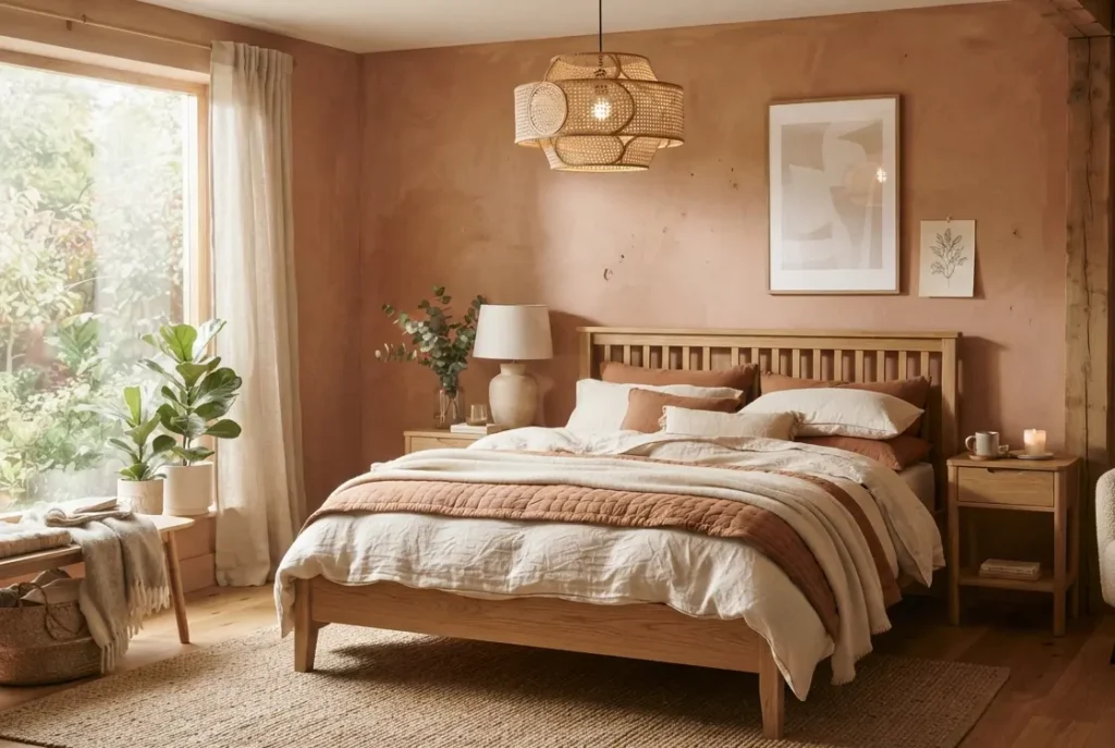
For a warm, organic bedroom, the dominant tone is almost always something earthy. Terracotta, clay, warm taupe. Wood and woven texture end up doing more of the actual work than the paint does, if we’re honest.
Start With Light Direction, Not Colour
East and northeast bedrooms in Bangalore get soft morning light and can take deeper, moodier tones without turning gloomy. South and west-facing rooms already run warm through the afternoon, so something a touch cooler keeps things from tipping into heavy.
Match Colour to Existing Wood Tones
If your bed frame or wardrobe already leans warm oak or walnut, stay in that family on the walls. We’ve walked into bedrooms where a cool grey wall sits right next to warm wood, and it just looks like nobody double-checked before the painter turned up. Happens more often than you’d guess.

Still deciding how far to take this? Our bedroom interior design services page is worth a look before you lock anything in. And if you’re not even sure which way your room faces, honestly, talk to our design team before you buy a single tin of paint.
What Are the Best Green Bedroom Design Ideas for a Warm Room?
Green is the one colour we almost never have to talk clients out of. It just gets along with wood, rattan and linen. No convincing required.
The trick with green bedroom design ideas in a warm bedroom is staying muted. Sage, olive, moss. Not the bright green you’d put on a kid’s playroom wall. A muted green echoes the natural materials already in the room, which is why it pairs so easily with wood furniture, jute rugs and warm brass fixtures.
The Houzz India Renovation Trends Study found homeowners renovating bedrooms are shifting toward nature-inspired, muted palettes over bright statement colours. Matches what we’re seeing on-site too, for what that’s worth.
Manish’s line on this hasn’t changed in years, and honestly he says it slightly differently every time but the point’s the same. An olive or sage wall, paired with natural wood and a woven headboard, reads more expensive than an all-white room. Every time. Someone on the team usually says it before he gets the chance to know.
How Do Blue Bedroom Design Ideas Work Without Feeling Cold?
Blue has a reputation problem in bedrooms. Done wrong, it feels like a hospital corridor. Done right, it’s one of the most restful colours you can put on a wall. There isn’t really a middle version of blue that works.
Comes down to undertone, mostly. Blue bedroom design ideas that hold up in a warm room lean dusty and greyed-out, never bright or icy. That grey undertone softens blue’s coolness, though it still wants cream linens, brass hardware and wood flooring around it or it starts feeling a bit stark on its own.
Pick a blue with a grey or green undertone, not a true saturated blue, and it’ll sit comfortably next to terracotta or warm wood instead of fighting it for attention.
Best Pairings for Dusty Blue Walls
Warm oak furniture. Linen or boucle textiles. Brass or rattan lighting. That’s the combination we keep landing on, project after project, almost without trying at this point.

Lighting matters more here than most people expect it to. Our [wall lamps] page has a few options that hold up well against muted blue and warm wood together.
Which Grey Paint Colours Work Best for a Textured Bedroom?
Grey gets called boring more than any other colour on this list. Fair, mostly. Cool grey in a warm, textured bedroom just sits there. Doing nothing. Not helping the room, not hurting it either, just present.
Warm grey is a different animal though. Grey paint colours ideas built around greige rather than cool, blue-based grey give texture and wood tones somewhere to actually stand out. We use it constantly as a base neutral, then add one bolder accent wall on top of it.
Skip cool, blue-toned greys if your room already leans on warm wood or terracotta. They read clinical fast. Clinical’s the last thing a warm bedroom needs, no matter how good the grey looked in the shop.
Can Purple Paint Colours for Walls Work in a Warm Bedroom?
Purple’s the one clients ask about most nervously. Fair enough too, it can go wrong quickly if the shade’s even slightly off.
Muted, dusty purples, mauve or plum, actually work in a warm bedroom because they share undertones with terracotta and clay. Purple paint colours for walls in this style should stay to one wall or a textile accent, cushions, maybe a throw, and that’s it. A full room of purple, even a muted one, overwhelms an organic scheme faster than most people expect.

Thinking about an accent wall but not sure how bold to actually go? Book a consultation and we’ll show you options in your own room, not under shop lighting where everything looks like something it isn’t.
How Do You Coordinate Inside Colours for Home Consistency?
A bedroom that has nothing to do with the hallway outside feels off, even when the room looks fine sitting on its own. You notice it the second you walk into a home where every room is decided separately, like each door opens into a slightly different house.
Getting your inside colours for home to feel connected really comes down to repeating one warm undertone, wood, terracotta, clay, olive, at different strengths as you move through. Not the same colour everywhere, that would look flat. Just the same underlying warmth, carried through room to room.
If your living room already runs warm, our Vastu colours for home guide and living room interior design guide cover palettes that carry through without a hard stop at the bedroom door.
Real Bangalore Project: A Warm, Organic Master Bedroom in HSR Layout
A client in HSR Layout came to us with a fairly standard beige master bedroom and asked, more or less, for something that felt like them instead of a rental unit. We moved the walls to a warm terracotta and olive combination, brought in a walnut bed frame, linen bedding, and a woven rattan light fixture. The room faces east, so the deeper wall tone reads warm through the morning instead of dark, and by evening it settles into something genuinely restful rather than just dim. That contrast, morning versus night, was actually the first thing the client brought up when we checked in afterward. Not the colour itself. The way it changed through the day.

A few more examples like this sit in our portfolio. If you’re working through a shared bedroom with a partner, our [couples bedroom] page covers the extra layout and palette considerations two people’s preferences tend to bring. If rustic pulls at you more than mid-century, our [rustic bedroom style] page goes further into that. And for everything beyond colour, furniture through to full execution, our interior design services page covers the complete scope.
What Bangalore Homeowners Get Wrong About Bedroom Colour
Same mistake, nearly every second site visit, without fail. Someone picks a colour off an Instagram photo shot in a completely different light, in a completely different room, and expects it to behave the same way in theirs. It almost never does. Screens flatten colour. Your bedroom wall isn’t going to do you that favour.
“The biggest mistake I see homeowners make is choosing a bedroom colour off a Pinterest screenshot without checking it against their room’s actual light and existing wood tones. The same terracotta that looks warm and rich in one room can look muddy in another.” Manish Jain, Founder and Creative Director, Blue Interiors, 2026.
One pattern that keeps showing up across our own projects: east and northeast bedrooms handle deeper, moodier tones noticeably better than south or west-facing rooms, which already run warm through the afternoon and need something cooler to balance them out. It’s not written down in any generic colour guide anywhere. It’s just what shows up once you’ve painted enough rooms in this particular city, in this particular light.
FAQs: Bedroom Colour Ideas
What is the best colour for a bedroom to promote sleep?
Muted, desaturated colours like dusty blue, sage green or warm taupe tend to promote better sleep than bright or saturated shades, since low contrast tones are less stimulating at night.
What is the most popular bedroom colour combination?
Warm neutral walls, beige, taupe or terracotta, paired with wood furniture and one deeper accent tone like olive green or slate blue, is what we see most often in Indian homes right now.
Which colour is best for a bedroom as per Vastu?
Vastu generally favours soft blues, greens, pinks and earthy browns for bedrooms, and advises against bright red, black and very dark grey. Our Vastu colours for home guide break this down by direction.
What colour should I avoid in a bedroom?
Bright, saturated colours like fire engine red, neon shades, or very dark cool greys tend to feel overstimulating, which works against what a bedroom is actually for.
Does bedroom colour affect mood?
Yes. Muted blues and greens are consistently linked to lower stress and better rest, while bright, high contrast colours read as more energising than restful.
Conclusion
A good bedroom colour schemes is never really about the colour on its own. It’s your room’s light, your existing wood tones, and the textures you already gravitate toward, all working together. Green, dusty blue, warm grey with a purple accent, whichever way you lean, the goal’s a room that feels intentional the second you walk in. Getting that right on a swatch is the easy part. Getting it right in the actual room, with actual furniture and actual light, is where most homeowners end up wanting a second opinion.
Book Your Bedroom Colour Consultation
Stop guessing which colour will actually work in your room. Blue Interiors will help you pick your palette and execute it end to end, walls, textiles and furniture, coordinated as one scheme instead of three separate decisions made months apart. Book a free design consultation or run your numbers through our price calculator to see what your bedroom will actually cost before you commit to anything.
Author Bio
Manish Jain is the Founder and Creative Director of Blue Interiors, with 15+ years of excellence in luxury residential and commercial interiors. He leads Blue Interiors’ design team across Bangalore, specialising in translating homeowners’ style references into fully executed interiors.